BrightMix.com Gets Rebranded
December 11th, 2007 by Kevin
Well, the time has come for a serious makeover to BrightMix.com. This website’s original layout was a slightly modified template for Mephisto, our blog software (go here and select “neon” from the drop down to see the original.) We received some complaints about it being a bit too weird… garish… and neon. However, before we were willing to take the time to redesign the site, we needed to get a real logo.
Our Logo Design Process
It took a good chunk of time for us to settle on a logo, partly because we couldn’t come up with any solid ideas and partly because our name doesn’t really represent anything. If we had picked a name like Blue Buzzard or Fog Creek Software, well, it would’ve been a little easier
Anyway, we were pretty certain that we needed an insignia as part of the logo; we didn’t know exactly what that insignia would be, other than something that was unique and representative of us.
So, we read a lot about other small company’s branding efforts and figured we’d try out similar brainstorming tactics. Here are some of our initial ideas:
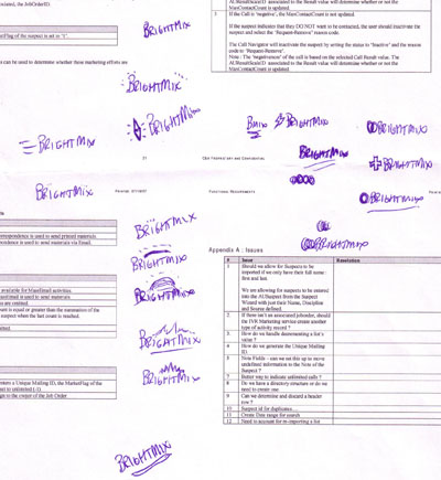
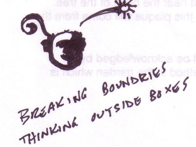
We discovered that it was far too easy to put too much thought and meaning into a logo. I mean, it’s simple to say we want a logo that says we’re smart, cutting-edge, trendy, and fun, but portraying all of those descriptions, all at once, is very difficult. For instance, this logo is trying to portray just a little too much and becomes somewhat confusing:
Not really finding anything that felt right, we worked with our friends at the Granger Group to experiment and come up with ideas.
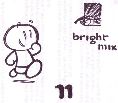
At some point, Bob from Granger came up with this and we really liked it. It was simple and had a cool and unique font:
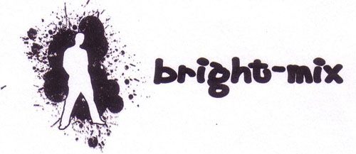
We tweaked it a bit by altering the fonts and swapping out the little people out for real i’s (we felt they were too gimmicky). A couple of days later we had our final logo, which sits atop this page. A big thanks to the Granger Group for helping us find something we like!
Fixing the Site’s Colors
With our logo in the bag, we just need to integrate it into the existing site. After some color matching and graphics editing (admittedly, mostly done by Dusty), the site was looking pretty good. While he was at it, he revamped the blog commenting section, which is now much cleaner and allows for markup, and added a Flickr gallery to bottom of the page to show off some of the realness of our company.
We’re pretty pleased with the new site. It’s not super-amazingly-awesome, but it’s leaps and bounds better than the old one. In case you never saw the old site, here is a side by side comparison of old and new:![]() |
![]() |
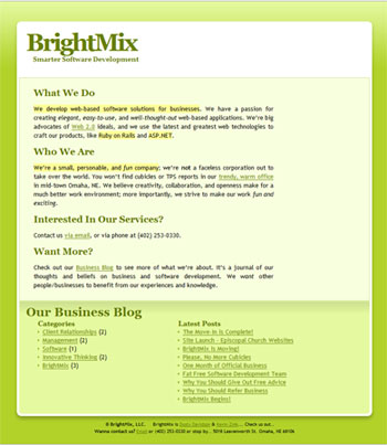
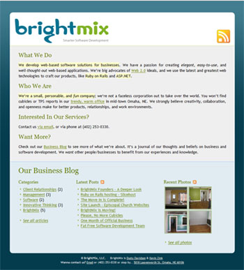
Your Feedback Appreciated
We’d love to hear what you think about the new site. Is it good / bad / better / worse / terrible / you’d rather stare at flashing spyware ads? Leave us a comment!


Andrew 9 months ago
I am very pleased with the redesigned site. It’s much easier on the eyes, and everything ties together nicely. Yet, there is always room for improvement so I’ll offer a few suggestions.
1) You don’t seem to have a favicon. So if I bookmark brightmix.com I get a generic page icon instead of some custom brightmix icon.
2) The flickr photo thumbnails really lighten the page and draw the eye. This is good. Unfortunately, one of the flickr photos displayed on the homepage is a toilet. This is not the best for first impressions. What of the other photos? a fan, another bathroom shot, a fridge. You should put more care into selecting these photos. You have a wonderfully bright office space, use this to show it off! You have sleek development machines in a clean working area, show this off! If somebody only sees four thumbnail pictures of your office, which ones do you want them to see? Take some time and care to select stunning shots that make people jealous of that beautiful office.
3) What’s with the novelty over-sized RSS feed icon? If I didn’t know better, I’d think it were part of the logo of your site. You already have appropriate RSS icons at the bottom next to “Latest Posts” and “Recent Photos.” Also, my browser displays an RSS icon in the address bar when I visit this site. The large RSS icon seems superfluous and out of place.
Kevin 9 months ago
Your comments are well taken, Andrew.
Please leave more constructive comments like this in the future!
Dusty 9 months ago
Andrew,
Thanks for the suggestions! We’ve taken a little time this morning and addressed most of them..
1 – Zink went ahead and created us a nice little “b” for a favicon. Not too shabby I must say!
2 – Point well taken about the toilet picture on our homepage. I’ve added “awesome” tags to some of our flickr pictures, so from now own, only the truly awesome photos will show up in the footer.
3 – I tend to agree about the randomly large RSS icon. I really don’t even know where that came from. For now it fills the space, so we’ll leave it, but we’re brainstorming new ideas for what to put there.
Thanks again,
Dusty
Ian 9 months ago
Love the new design guys, keep up the good work!
Can’t think of anything that really stands out needing improvement, but I do like a little more spacing in lists and paragaraphs (line-height ~18-20px believe-it-or-not… just makes things “friendlier” to read) and some more spacing in your lists at the bottom of the pages (just padding, line-height’s fine).
Kick-ass job with everything guys!
Ian 9 months ago
On a side note, I forgot to mention that this redesign has shamed me into seriously redoing my site… I suppose I’m finally ready to take that plunge.
Dusty 9 months ago
Ian,
I just noticed what you were saying about the list line-height. Oddly enough, the paragraph line-height was 19px, but lists had none. That was making things look a little odd. They both match now, and things look way better! Thanks for the tip!
Dusty
p.s. Yes, you should definitely redo your site. Or just post more often! Ha.
Maren Hogan 8 months ago
You guys are cool! Your office looks super sweet and you gotta stay east side! Check out bigorecruiting.blogspot.com for all about IT in the Big O! Let me know what you’re looking for. Love to network with small biz in Omaha
Leave a Comment